Glassmorphism Navbar with Dark/Light Theme.
A glassmorphism navbar with dark/light theme toggle, click-based dropdown menus, social icons, mobile slide-out drawer with accordion navigation, scroll effect, and localStorage theme persistence — built with pure HTML, CSS & Vanilla JavaScript.
- Published 22 Aug 2026
- 61 views

Overview
Glassmorphism Navbar with Dark/Light Theme & Dropdown
A fully responsive glassmorphism navbar with dark and light theme toggle, click-triggered dropdown menus with icon cards, social icons, scroll shrink effect, mobile slide-out drawer with accordion navigation, and localStorage theme persistence — built with pure HTML, CSS & Vanilla JavaScript. No frameworks, no build tools needed.
What's Included
- Glassmorphism navbar with
backdrop-filter: blurand glass border - Dark and light theme toggle with
localStoragepersistence — theme saved across page reloads - Complete CSS variable system — separate token sets for dark and light via
[data-theme] - Click-triggered dropdown menus with icon cards, title, and subtitle per item
- Caret arrow indicator on top of each dropdown
- Chevron icon rotates 180° when dropdown is open
- Close dropdown on outside click or
Escapekey - Scroll effect — navbar background darkens and shadow deepens on scroll
- Social icons (GitHub, Twitter, Discord) with per-icon hover color
- Divider between social icons and theme toggle
- Ghost and primary CTA buttons in header
- Animated hamburger → X icon on mobile toggle
- Mobile slide-out drawer from right with backdrop overlay
- Drawer accordion navigation — one section open at a time
- Active link highlight on click — synced between desktop nav and drawer
- Drawer closes automatically on window resize above
860px ESCkey closes both dropdowns and drawer- Body scroll locked while mobile drawer is open
- Fully responsive — nav links hide at
860px, social icons hide at1024px - All design tokens via CSS custom properties per theme
- Zero dependencies — pure HTML, CSS, Vanilla JS
Dependencies
| Name | Version | Type |
|---|---|---|
| Google Fonts — Clash Display + Outfit | latest | CDN |
| Material Icons Round | latest | CDN |
| Font Awesome | v6.5.1 | CDN |
Copy all CDN links from the
<head>ofindex.htmland paste into your project before your stylesheet.
Desktop Preview

HTML
Copy the full markup — overlay div, navbar, mobile drawer, and hero demo section — and paste inside your <body>.
html1<!doctype html> 2<html lang="en" data-theme="dark"> 3 <head> 4 <meta charset="UTF-8" /> 5 <meta name="viewport" content="width=device-width, initial-scale=1.0" /> 6 <title>Navbar | Glassify</title> 7 8 <!-- Google Fonts --> 9 <link rel="preconnect" href="https://fonts.googleapis.com" /> 10 <link rel="preconnect" href="https://fonts.gstatic.com" crossorigin /> 11 <link 12 href="https://fonts.googleapis.com/css2?family=Clash+Display:wght@400;500;600;700&family=Outfit:wght@300;400;500;600&display=swap" 13 rel="stylesheet" 14 /> 15 16 <!-- Material Icons --> 17 <link 18 href="https://fonts.googleapis.com/icon?family=Material+Icons+Round" 19 rel="stylesheet" 20 /> 21 22 <!-- Font Awesome for Social Icons --> 23 <link 24 rel="stylesheet" 25 href="https://cdnjs.cloudflare.com/ajax/libs/font-awesome/6.5.1/css/all.min.css" 26 /> 27 28 <link rel="stylesheet" href="style.css" /> 29 </head> 30 <body> 31 <!-- OVERLAY (mobile menu backdrop) --> 32 <div class="overlay" id="overlay"></div> 33 34 <!-- ===== NAVBAR ===== --> 35 <nav class="navbar" id="navbar"> 36 <div class="nav-container"> 37 <!-- LOGO --> 38 <a href="#" class="nav-logo"> 39 <div class="logo-icon"> 40 <svg width="22" height="22" viewBox="0 0 24 24" fill="none"> 41 <path 42 d="M12 2L2 7l10 5 10-5-10-5z" 43 fill="currentColor" 44 opacity="0.9" 45 /> 46 <path 47 d="M2 17l10 5 10-5" 48 stroke="currentColor" 49 stroke-width="2" 50 stroke-linecap="round" 51 fill="none" 52 opacity="0.7" 53 /> 54 <path 55 d="M2 12l10 5 10-5" 56 stroke="currentColor" 57 stroke-width="2" 58 stroke-linecap="round" 59 fill="none" 60 /> 61 </svg> 62 </div> 63 <span class="logo-text">Glassify</span> 64 </a> 65 66 <!-- CENTER NAV LINKS --> 67 <ul class="nav-links" id="navLinks"> 68 <li><a href="#" class="nav-link active">Home</a></li> 69 70 <!-- DROPDOWN: Products --> 71 <li class="dropdown-parent"> 72 <button class="nav-link dropdown-trigger" id="dropProducts"> 73 Products 74 <span class="material-icons-round chevron">expand_more</span> 75 </button> 76 <div class="dropdown-menu" id="menuProducts"> 77 <div class="dropdown-inner"> 78 <a href="#" class="dropdown-item"> 79 <span class="di-icon" 80 ><span class="material-icons-round">dashboard</span></span 81 > 82 <div> 83 <p class="di-title">Dashboard</p> 84 <p class="di-sub">All your metrics in one place</p> 85 </div> 86 </a> 87 <a href="#" class="dropdown-item"> 88 <span class="di-icon" 89 ><span class="material-icons-round">analytics</span></span 90 > 91 <div> 92 <p class="di-title">Analytics</p> 93 <p class="di-sub">Deep data insights</p> 94 </div> 95 </a> 96 <a href="#" class="dropdown-item"> 97 <span class="di-icon" 98 ><span class="material-icons-round">hub</span></span 99 > 100 <div> 101 <p class="di-title">Integrations</p> 102 <p class="di-sub">Connect your tools</p> 103 </div> 104 </a> 105 <a href="#" class="dropdown-item"> 106 <span class="di-icon" 107 ><span class="material-icons-round" 108 >rocket_launch</span 109 ></span 110 > 111 <div> 112 <p class="di-title">API</p> 113 <p class="di-sub">Build on our platform</p> 114 </div> 115 </a> 116 </div> 117 </div> 118 </li> 119 120 <!-- DROPDOWN: Company --> 121 <li class="dropdown-parent"> 122 <button class="nav-link dropdown-trigger" id="dropCompany"> 123 Company 124 <span class="material-icons-round chevron">expand_more</span> 125 </button> 126 <div class="dropdown-menu" id="menuCompany"> 127 <div class="dropdown-inner"> 128 <a href="#" class="dropdown-item"> 129 <span class="di-icon" 130 ><span class="material-icons-round">groups</span></span 131 > 132 <div> 133 <p class="di-title">About Us</p> 134 <p class="di-sub">Our story & mission</p> 135 </div> 136 </a> 137 <a href="#" class="dropdown-item"> 138 <span class="di-icon" 139 ><span class="material-icons-round">work</span></span 140 > 141 <div> 142 <p class="di-title">Careers</p> 143 <p class="di-sub">We're hiring!</p> 144 </div> 145 </a> 146 <a href="#" class="dropdown-item"> 147 <span class="di-icon" 148 ><span class="material-icons-round">newspaper</span></span 149 > 150 <div> 151 <p class="di-title">Blog</p> 152 <p class="di-sub">News & updates</p> 153 </div> 154 </a> 155 </div> 156 </div> 157 </li> 158 159 <li><a href="#" class="nav-link">Pricing</a></li> 160 <li><a href="#" class="nav-link">Docs</a></li> 161 </ul> 162 163 <!-- RIGHT SECTION --> 164 <div class="nav-right"> 165 <!-- Social Icons --> 166 <div class="social-icons"> 167 <a href="#" class="social-icon" aria-label="GitHub" 168 ><i class="fa-brands fa-github"></i 169 ></a> 170 <a href="#" class="social-icon" aria-label="Twitter" 171 ><i class="fa-brands fa-x-twitter"></i 172 ></a> 173 <a href="#" class="social-icon" aria-label="Discord" 174 ><i class="fa-brands fa-discord"></i 175 ></a> 176 </div> 177 178 <!-- Divider --> 179 <div class="nav-divider"></div> 180 181 <!-- Theme Toggle --> 182 <button 183 class="theme-toggle" 184 id="themeToggle" 185 aria-label="Toggle theme" 186 > 187 <span class="material-icons-round" id="themeIcon">light_mode</span> 188 </button> 189 190 <!-- CTA Buttons --> 191 <a href="login.html" class="btn-ghost">Sign In</a> 192 <a href="index.html" class="btn-primary">Get Started</a> 193 194 <!-- Hamburger (mobile) --> 195 <button class="hamburger" id="hamburger" aria-label="Open menu"> 196 <span></span> 197 <span></span> 198 <span></span> 199 </button> 200 </div> 201 </div> 202 </nav> 203 204 <!-- ===== MOBILE DRAWER ===== --> 205 <div class="mobile-drawer" id="mobileDrawer"> 206 <div class="drawer-header"> 207 <a href="#" class="nav-logo"> 208 <div class="logo-icon"> 209 <svg width="20" height="20" viewBox="0 0 24 24" fill="none"> 210 <path 211 d="M12 2L2 7l10 5 10-5-10-5z" 212 fill="currentColor" 213 opacity="0.9" 214 /> 215 <path 216 d="M2 17l10 5 10-5" 217 stroke="currentColor" 218 stroke-width="2" 219 stroke-linecap="round" 220 fill="none" 221 opacity="0.7" 222 /> 223 <path 224 d="M2 12l10 5 10-5" 225 stroke="currentColor" 226 stroke-width="2" 227 stroke-linecap="round" 228 fill="none" 229 /> 230 </svg> 231 </div> 232 <span class="logo-text">Glassify</span> 233 </a> 234 <button class="drawer-close" id="drawerClose"> 235 <span class="material-icons-round">close</span> 236 </button> 237 </div> 238 239 <div class="drawer-links"> 240 <a href="#" class="drawer-link active"> 241 <span class="material-icons-round">home</span> Home 242 </a> 243 244 <!-- Mobile Accordion: Products --> 245 <div class="drawer-accordion"> 246 <button class="drawer-link accordion-trigger" id="accProducts"> 247 <span class="left-group" 248 ><span class="material-icons-round">widgets</span> Products</span 249 > 250 <span class="material-icons-round acc-arrow">expand_more</span> 251 </button> 252 <div class="accordion-body" id="bodyProducts"> 253 <a href="#" class="accordion-link" 254 ><span class="material-icons-round">dashboard</span> Dashboard</a 255 > 256 <a href="#" class="accordion-link" 257 ><span class="material-icons-round">analytics</span> Analytics</a 258 > 259 <a href="#" class="accordion-link" 260 ><span class="material-icons-round">hub</span> Integrations</a 261 > 262 <a href="#" class="accordion-link" 263 ><span class="material-icons-round">rocket_launch</span> API</a 264 > 265 </div> 266 </div> 267 268 <!-- Mobile Accordion: Company --> 269 <div class="drawer-accordion"> 270 <button class="drawer-link accordion-trigger" id="accCompany"> 271 <span class="left-group" 272 ><span class="material-icons-round">business</span> Company</span 273 > 274 <span class="material-icons-round acc-arrow">expand_more</span> 275 </button> 276 <div class="accordion-body" id="bodyCompany"> 277 <a href="#" class="accordion-link" 278 ><span class="material-icons-round">groups</span> About Us</a 279 > 280 <a href="#" class="accordion-link" 281 ><span class="material-icons-round">work</span> Careers</a 282 > 283 <a href="#" class="accordion-link" 284 ><span class="material-icons-round">newspaper</span> Blog</a 285 > 286 </div> 287 </div> 288 289 <a href="#" class="drawer-link" 290 ><span class="material-icons-round">payments</span> Pricing</a 291 > 292 <a href="#" class="drawer-link" 293 ><span class="material-icons-round">menu_book</span> Docs</a 294 > 295 </div> 296 297 <div class="drawer-footer"> 298 <div class="drawer-socials"> 299 <a href="#" class="social-icon" 300 ><i class="fa-brands fa-github"></i 301 ></a> 302 <a href="#" class="social-icon" 303 ><i class="fa-brands fa-x-twitter"></i 304 ></a> 305 <a href="#" class="social-icon" 306 ><i class="fa-brands fa-discord"></i 307 ></a> 308 <a href="#" class="social-icon" 309 ><i class="fa-brands fa-linkedin"></i 310 ></a> 311 </div> 312 <div class="drawer-cta"> 313 <a href="login.html" class="btn-ghost full">Sign In</a> 314 <a href="index.html" class="btn-primary full">Get Started</a> 315 </div> 316 </div> 317 </div> 318 319 <!-- ===== DEMO HERO (just to show navbar in context) ===== --> 320 <section class="hero-demo"> 321 <h1>Beautiful Navbar<br /><span>in Glassmorphism</span></h1> 322 <p> 323 Dark & Light theme · Dropdown menus · Responsive drawer · Social 324 icons 325 </p> 326 <div class="hero-badges"> 327 <span class="badge" 328 ><span class="material-icons-round">dark_mode</span> Dark Mode</span 329 > 330 <span class="badge" 331 ><span class="material-icons-round">light_mode</span> Light Mode</span 332 > 333 <span class="badge" 334 ><span class="material-icons-round">phone_android</span> 335 Responsive</span 336 > 337 <span class="badge" 338 ><span class="material-icons-round">blur_on</span> Glassmorphism</span 339 > 340 </div> 341 </section> 342 343 <script src="script.js"></script> 344 </body> 345</html>
CSS
Paste into your stylesheet. Theme switching is handled entirely via [data-theme="dark"] and [data-theme="light"] attribute selectors — change --accent inside either block to retheme the entire component instantly.
css1/* =========================== 2 GOOGLE FONTS FALLBACK 3=========================== */ 4@import url("https://fonts.googleapis.com/css2?family=Outfit:wght@300;400;500;600&display=swap"); 5 6/* =========================== 7 THEME VARIABLES 8=========================== */ 9:root { 10 --font-display: "Clash Display", "Outfit", sans-serif; 11 --font-body: "Outfit", sans-serif; 12 --radius-nav: 16px; 13 --radius-drop: 14px; 14 --nav-height: 68px; 15 --transition: 0.3s cubic-bezier(0.4, 0, 0.2, 1); 16} 17 18/* ── DARK THEME ── */ 19[data-theme="dark"] { 20 --bg-page: #070b14; 21 --bg-page2: #0c1120; 22 --nav-glass: rgba(10, 15, 30, 0.55); 23 --nav-border: rgba(99, 200, 255, 0.12); 24 --nav-shadow: rgba(0, 0, 0, 0.45); 25 --drop-glass: rgba(8, 14, 28, 0.82); 26 --drop-border: rgba(99, 200, 255, 0.14); 27 --drawer-bg: rgba(7, 11, 22, 0.97); 28 --overlay-bg: rgba(0, 0, 0, 0.65); 29 30 --accent: #22d3ee; /* cyan */ 31 --accent2: #38bdf8; /* sky */ 32 --accent3: #0ea5e9; 33 --accent-glow: rgba(34, 211, 238, 0.25); 34 --accent-glow2: rgba(34, 211, 238, 0.08); 35 36 --text-main: #e2f0ff; 37 --text-sub: #7a9ab8; 38 --text-muted: #4a6a88; 39 --link-hover: #22d3ee; 40 41 --btn-ghost-bg: rgba(34, 211, 238, 0.07); 42 --btn-ghost-border: rgba(34, 211, 238, 0.25); 43 --btn-ghost-hover: rgba(34, 211, 238, 0.15); 44 45 --hero-title: #e2f0ff; 46 --hero-span: #22d3ee; 47 --badge-bg: rgba(34, 211, 238, 0.08); 48 --badge-border: rgba(34, 211, 238, 0.2); 49} 50 51/* ── LIGHT THEME ── */ 52[data-theme="light"] { 53 --bg-page: #f0f6ff; 54 --bg-page2: #e4eef8; 55 --nav-glass: rgba(255, 255, 255, 0.65); 56 --nav-border: rgba(14, 165, 233, 0.18); 57 --nav-shadow: rgba(14, 120, 200, 0.12); 58 --drop-glass: rgba(255, 255, 255, 0.9); 59 --drop-border: rgba(14, 165, 233, 0.15); 60 --drawer-bg: rgba(248, 252, 255, 0.98); 61 --overlay-bg: rgba(10, 30, 60, 0.4); 62 63 --accent: #0284c7; 64 --accent2: #0ea5e9; 65 --accent3: #38bdf8; 66 --accent-glow: rgba(2, 132, 199, 0.2); 67 --accent-glow2: rgba(2, 132, 199, 0.06); 68 69 --text-main: #0a1929; 70 --text-sub: #3d6080; 71 --text-muted: #7aadcc; 72 --link-hover: #0284c7; 73 74 --btn-ghost-bg: rgba(2, 132, 199, 0.06); 75 --btn-ghost-border: rgba(2, 132, 199, 0.25); 76 --btn-ghost-hover: rgba(2, 132, 199, 0.12); 77 78 --hero-title: #0a1929; 79 --hero-span: #0284c7; 80 --badge-bg: rgba(2, 132, 199, 0.08); 81 --badge-border: rgba(2, 132, 199, 0.2); 82} 83 84/* =========================== 85 RESET & BASE 86=========================== */ 87*, 88*::before, 89*::after { 90 box-sizing: border-box; 91 margin: 0; 92 padding: 0; 93} 94 95html { 96 scroll-behavior: smooth; 97} 98 99body { 100 font-family: var(--font-body); 101 background: var(--bg-page); 102 color: var(--text-main); 103 min-height: 100vh; 104 transition: 105 background var(--transition), 106 color var(--transition); 107 overflow-x: hidden; 108} 109 110a { 111 text-decoration: none; 112 color: inherit; 113} 114button { 115 font-family: var(--font-body); 116 background: none; 117 border: none; 118 cursor: pointer; 119} 120ul { 121 list-style: none; 122} 123 124/* =========================== 125 OVERLAY 126=========================== */ 127.overlay { 128 position: fixed; 129 inset: 0; 130 background: var(--overlay-bg); 131 backdrop-filter: blur(4px); 132 z-index: 200; 133 opacity: 0; 134 pointer-events: none; 135 transition: opacity var(--transition); 136} 137 138.overlay.active { 139 opacity: 1; 140 pointer-events: all; 141} 142 143/* =========================== 144 NAVBAR 145=========================== */ 146.navbar { 147 position: fixed; 148 top: 0; 149 left: 0; 150 right: 0; 151 z-index: 300; 152 height: var(--nav-height); 153 padding: 0 20px; 154 background: var(--nav-glass); 155 backdrop-filter: blur(20px) saturate(160%); 156 -webkit-backdrop-filter: blur(20px) saturate(160%); 157 border-bottom: 1px solid var(--nav-border); 158 box-shadow: 0 8px 40px var(--nav-shadow); 159 transition: 160 background var(--transition), 161 border-color var(--transition), 162 box-shadow var(--transition); 163} 164 165/* Scrolled state */ 166.navbar.scrolled { 167 background: var(--drop-glass); 168 box-shadow: 169 0 12px 48px var(--nav-shadow), 170 0 0 0 1px var(--nav-border); 171} 172 173.nav-container { 174 max-width: 1240px; 175 margin: 0 auto; 176 height: 100%; 177 display: flex; 178 align-items: center; 179 gap: 12px; 180} 181 182/* =========================== 183 LOGO 184=========================== */ 185.nav-logo { 186 display: flex; 187 align-items: center; 188 gap: 10px; 189 flex-shrink: 0; 190 text-decoration: none; 191} 192 193.logo-icon { 194 width: 36px; 195 height: 36px; 196 border-radius: 10px; 197 background: linear-gradient(135deg, var(--accent), var(--accent3)); 198 display: flex; 199 align-items: center; 200 justify-content: center; 201 color: #fff; 202 box-shadow: 0 4px 14px var(--accent-glow); 203 transition: 204 transform var(--transition), 205 box-shadow var(--transition); 206} 207 208.nav-logo:hover .logo-icon { 209 transform: rotate(-8deg) scale(1.08); 210 box-shadow: 0 6px 20px var(--accent-glow); 211} 212 213.logo-text { 214 font-family: var(--font-display); 215 font-size: 19px; 216 font-weight: 700; 217 letter-spacing: -0.3px; 218 color: var(--text-main); 219 transition: color var(--transition); 220} 221 222/* =========================== 223 CENTER NAV LINKS 224=========================== */ 225.nav-links { 226 display: flex; 227 align-items: center; 228 gap: 2px; 229 margin: 0 auto; 230} 231 232.nav-link { 233 display: flex; 234 align-items: center; 235 gap: 4px; 236 padding: 8px 14px; 237 border-radius: 10px; 238 font-size: 14px; 239 font-weight: 500; 240 color: var(--text-sub); 241 cursor: pointer; 242 transition: 243 color var(--transition), 244 background var(--transition); 245 white-space: nowrap; 246 border: none; 247 background: none; 248 font-family: var(--font-body); 249 letter-spacing: 0.1px; 250} 251 252.nav-link:hover, 253.nav-link.active { 254 color: var(--text-main); 255 background: var(--accent-glow2); 256} 257 258.nav-link.active { 259 color: var(--accent); 260} 261 262.chevron { 263 font-size: 16px !important; 264 transition: transform var(--transition); 265} 266 267.dropdown-parent.open .chevron { 268 transform: rotate(180deg); 269} 270 271/* =========================== 272 DROPDOWN MENU 273=========================== */ 274.dropdown-parent { 275 position: relative; 276} 277 278.dropdown-menu { 279 position: absolute; 280 top: calc(100% + 14px); 281 left: 50%; 282 transform: translateX(-50%) translateY(-8px); 283 min-width: 280px; 284 background: var(--drop-glass); 285 backdrop-filter: blur(24px) saturate(180%); 286 -webkit-backdrop-filter: blur(24px) saturate(180%); 287 border: 1px solid var(--drop-border); 288 border-radius: var(--radius-drop); 289 box-shadow: 290 0 20px 60px var(--nav-shadow), 291 0 0 0 1px var(--drop-border); 292 opacity: 0; 293 pointer-events: none; 294 transition: 295 opacity 0.25s ease, 296 transform 0.25s ease; 297 z-index: 400; 298} 299 300.dropdown-parent.open .dropdown-menu { 301 opacity: 1; 302 pointer-events: all; 303 transform: translateX(-50%) translateY(0); 304} 305 306/* Caret arrow */ 307.dropdown-menu::before { 308 content: ""; 309 position: absolute; 310 top: -6px; 311 left: 50%; 312 transform: translateX(-50%) rotate(45deg); 313 width: 12px; 314 height: 12px; 315 background: var(--drop-glass); 316 border-left: 1px solid var(--drop-border); 317 border-top: 1px solid var(--drop-border); 318 border-radius: 2px; 319} 320 321.dropdown-inner { 322 padding: 8px; 323 display: flex; 324 flex-direction: column; 325 gap: 2px; 326} 327 328.dropdown-item { 329 display: flex; 330 align-items: center; 331 gap: 14px; 332 padding: 11px 12px; 333 border-radius: 10px; 334 transition: background var(--transition); 335 cursor: pointer; 336} 337 338.dropdown-item:hover { 339 background: var(--accent-glow2); 340} 341 342.di-icon { 343 width: 36px; 344 height: 36px; 345 border-radius: 9px; 346 background: var(--accent-glow2); 347 border: 1px solid var(--drop-border); 348 display: flex; 349 align-items: center; 350 justify-content: center; 351 flex-shrink: 0; 352 transition: 353 background var(--transition), 354 border-color var(--transition); 355} 356 357.dropdown-item:hover .di-icon { 358 background: var(--accent-glow); 359 border-color: var(--accent); 360} 361 362.di-icon .material-icons-round { 363 font-size: 17px; 364 color: var(--accent); 365} 366 367.di-title { 368 font-size: 13.5px; 369 font-weight: 600; 370 color: var(--text-main); 371 margin-bottom: 2px; 372} 373 374.di-sub { 375 font-size: 11.5px; 376 color: var(--text-sub); 377} 378 379/* =========================== 380 NAV RIGHT 381=========================== */ 382.nav-right { 383 display: flex; 384 align-items: center; 385 gap: 10px; 386 flex-shrink: 0; 387} 388 389/* Social Icons */ 390.social-icons { 391 display: flex; 392 align-items: center; 393 gap: 4px; 394} 395 396.social-icon { 397 width: 34px; 398 height: 34px; 399 border-radius: 9px; 400 display: flex; 401 align-items: center; 402 justify-content: center; 403 color: var(--text-sub); 404 font-size: 15px; 405 transition: 406 color var(--transition), 407 background var(--transition), 408 transform var(--transition); 409 border: 1px solid transparent; 410 text-decoration: none; 411} 412 413.social-icon:hover { 414 color: var(--accent); 415 background: var(--accent-glow2); 416 border-color: var(--drop-border); 417 transform: translateY(-2px); 418} 419 420/* Divider */ 421.nav-divider { 422 width: 1px; 423 height: 22px; 424 background: var(--nav-border); 425 flex-shrink: 0; 426} 427 428/* Theme Toggle */ 429.theme-toggle { 430 width: 36px; 431 height: 36px; 432 border-radius: 10px; 433 display: flex; 434 align-items: center; 435 justify-content: center; 436 color: var(--text-sub); 437 border: 1px solid var(--nav-border); 438 background: var(--accent-glow2); 439 transition: all var(--transition); 440 flex-shrink: 0; 441} 442 443.theme-toggle:hover { 444 color: var(--accent); 445 background: var(--accent-glow); 446 border-color: var(--accent); 447 transform: rotate(20deg); 448} 449 450.theme-toggle .material-icons-round { 451 font-size: 18px; 452} 453 454/* Buttons */ 455.btn-ghost { 456 padding: 8px 16px; 457 border-radius: 10px; 458 font-size: 13.5px; 459 font-weight: 600; 460 color: var(--accent); 461 border: 1px solid var(--btn-ghost-border); 462 background: var(--btn-ghost-bg); 463 transition: all var(--transition); 464 white-space: nowrap; 465 text-decoration: none; 466 display: inline-flex; 467 align-items: center; 468} 469 470.btn-ghost:hover { 471 background: var(--btn-ghost-hover); 472 box-shadow: 0 4px 14px var(--accent-glow); 473 transform: translateY(-1px); 474} 475 476.btn-primary { 477 padding: 8px 18px; 478 border-radius: 10px; 479 font-size: 13.5px; 480 font-weight: 600; 481 color: #fff; 482 background: linear-gradient(135deg, var(--accent), var(--accent3)); 483 box-shadow: 0 4px 16px var(--accent-glow); 484 transition: all var(--transition); 485 white-space: nowrap; 486 text-decoration: none; 487 display: inline-flex; 488 align-items: center; 489 border: none; 490} 491 492.btn-primary:hover { 493 transform: translateY(-2px); 494 box-shadow: 0 8px 24px var(--accent-glow); 495 filter: brightness(1.1); 496} 497 498/* Hamburger */ 499.hamburger { 500 display: none; 501 flex-direction: column; 502 justify-content: center; 503 gap: 5px; 504 width: 36px; 505 height: 36px; 506 padding: 6px; 507 border-radius: 10px; 508 border: 1px solid var(--nav-border); 509 background: var(--accent-glow2); 510 transition: background var(--transition); 511} 512 513.hamburger span { 514 display: block; 515 height: 2px; 516 border-radius: 2px; 517 background: var(--text-main); 518 transition: all 0.3s ease; 519 transform-origin: center; 520} 521 522.hamburger.open span:nth-child(1) { 523 transform: translateY(7px) rotate(45deg); 524} 525.hamburger.open span:nth-child(2) { 526 opacity: 0; 527 transform: scaleX(0); 528} 529.hamburger.open span:nth-child(3) { 530 transform: translateY(-7px) rotate(-45deg); 531} 532 533/* =========================== 534 MOBILE DRAWER 535=========================== */ 536.mobile-drawer { 537 position: fixed; 538 top: 0; 539 right: 0; 540 width: min(320px, 88vw); 541 height: 100vh; 542 z-index: 500; 543 background: var(--drawer-bg); 544 backdrop-filter: blur(30px) saturate(160%); 545 -webkit-backdrop-filter: blur(30px) saturate(160%); 546 border-left: 1px solid var(--nav-border); 547 box-shadow: -20px 0 60px var(--nav-shadow); 548 display: flex; 549 flex-direction: column; 550 transform: translateX(100%); 551 transition: transform 0.38s cubic-bezier(0.4, 0, 0.2, 1); 552 overflow-y: auto; 553} 554 555.mobile-drawer.open { 556 transform: translateX(0); 557} 558 559.drawer-header { 560 display: flex; 561 align-items: center; 562 justify-content: space-between; 563 padding: 20px 20px; 564 border-bottom: 1px solid var(--nav-border); 565 flex-shrink: 0; 566} 567 568.drawer-close { 569 width: 34px; 570 height: 34px; 571 border-radius: 9px; 572 display: flex; 573 align-items: center; 574 justify-content: center; 575 color: var(--text-sub); 576 border: 1px solid var(--nav-border); 577 background: var(--accent-glow2); 578 transition: all var(--transition); 579} 580 581.drawer-close:hover { 582 color: var(--accent); 583 background: var(--accent-glow); 584} 585 586.drawer-close .material-icons-round { 587 font-size: 18px; 588} 589 590/* Drawer Links */ 591.drawer-links { 592 flex: 1; 593 padding: 14px 14px; 594 display: flex; 595 flex-direction: column; 596 gap: 4px; 597 overflow-y: auto; 598} 599 600.drawer-link { 601 display: flex; 602 align-items: center; 603 justify-content: space-between; 604 gap: 12px; 605 padding: 12px 14px; 606 border-radius: 11px; 607 font-size: 14.5px; 608 font-weight: 500; 609 color: var(--text-sub); 610 border: none; 611 background: none; 612 width: 100%; 613 text-align: left; 614 cursor: pointer; 615 font-family: var(--font-body); 616 transition: all var(--transition); 617 text-decoration: none; 618} 619 620.drawer-link .material-icons-round { 621 font-size: 19px; 622 color: var(--text-muted); 623 transition: color var(--transition); 624} 625.drawer-link.active, 626.drawer-link:hover { 627 color: var(--text-main); 628 background: var(--accent-glow2); 629} 630.drawer-link.active .material-icons-round, 631.drawer-link:hover .material-icons-round { 632 color: var(--accent); 633} 634 635/* Accordion */ 636.drawer-accordion { 637 display: flex; 638 flex-direction: column; 639} 640 641.accordion-trigger { 642 justify-content: space-between; 643} 644.left-group { 645 display: flex; 646 align-items: center; 647 gap: 12px; 648} 649 650.acc-arrow { 651 font-size: 18px !important; 652 transition: transform var(--transition); 653 color: var(--text-muted) !important; 654} 655 656.drawer-accordion.open .acc-arrow { 657 transform: rotate(180deg); 658} 659 660.accordion-body { 661 display: none; 662 flex-direction: column; 663 gap: 2px; 664 padding: 4px 0 4px 14px; 665 overflow: hidden; 666} 667 668.drawer-accordion.open .accordion-body { 669 display: flex; 670} 671 672.accordion-link { 673 display: flex; 674 align-items: center; 675 gap: 10px; 676 padding: 10px 14px; 677 border-radius: 9px; 678 font-size: 13.5px; 679 color: var(--text-sub); 680 transition: all var(--transition); 681 text-decoration: none; 682} 683 684.accordion-link .material-icons-round { 685 font-size: 17px; 686 color: var(--text-muted); 687} 688.accordion-link:hover { 689 color: var(--accent); 690 background: var(--accent-glow2); 691} 692.accordion-link:hover .material-icons-round { 693 color: var(--accent); 694} 695 696/* Drawer Footer */ 697.drawer-footer { 698 padding: 16px 16px 24px; 699 border-top: 1px solid var(--nav-border); 700 flex-shrink: 0; 701 display: flex; 702 flex-direction: column; 703 gap: 16px; 704} 705 706.drawer-socials { 707 display: flex; 708 align-items: center; 709 justify-content: center; 710 gap: 8px; 711} 712 713.drawer-cta { 714 display: flex; 715 flex-direction: column; 716 gap: 8px; 717} 718 719.btn-ghost.full, 720.btn-primary.full { 721 width: 100%; 722 justify-content: center; 723 padding: 11px; 724 font-size: 14px; 725 border-radius: 12px; 726} 727 728/* =========================== 729 HERO DEMO SECTION 730=========================== */ 731.hero-demo { 732 min-height: 100vh; 733 display: flex; 734 flex-direction: column; 735 align-items: center; 736 justify-content: center; 737 text-align: center; 738 padding: 120px 24px 60px; 739 position: relative; 740 overflow: hidden; 741} 742 743.hero-demo::before { 744 content: ""; 745 position: fixed; 746 width: 600px; 747 height: 600px; 748 border-radius: 50%; 749 background: radial-gradient(circle, var(--accent-glow), transparent 70%); 750 top: 50%; 751 left: 50%; 752 transform: translate(-50%, -50%); 753 pointer-events: none; 754 z-index: 0; 755 animation: pulse 6s ease-in-out infinite; 756} 757 758@keyframes pulse { 759 0%, 760 100% { 761 opacity: 0.6; 762 transform: translate(-50%, -50%) scale(1); 763 } 764 50% { 765 opacity: 1; 766 transform: translate(-50%, -50%) scale(1.1); 767 } 768} 769 770.hero-demo h1 { 771 position: relative; 772 font-family: var(--font-display); 773 font-size: clamp(44px, 7vw, 88px); 774 font-weight: 700; 775 line-height: 1.1; 776 color: var(--hero-title); 777 letter-spacing: -2px; 778 margin-bottom: 20px; 779 z-index: 1; 780} 781 782.hero-demo h1 span { 783 background: linear-gradient(135deg, var(--accent), var(--accent3)); 784 -webkit-background-clip: text; 785 -webkit-text-fill-color: transparent; 786 background-clip: text; 787} 788 789.hero-demo > p { 790 position: relative; 791 font-size: 16px; 792 color: var(--text-sub); 793 max-width: 500px; 794 line-height: 1.7; 795 margin-bottom: 36px; 796 z-index: 1; 797} 798 799.hero-badges { 800 position: relative; 801 display: flex; 802 flex-wrap: wrap; 803 align-items: center; 804 justify-content: center; 805 gap: 10px; 806 z-index: 1; 807} 808 809.badge { 810 display: flex; 811 align-items: center; 812 gap: 6px; 813 padding: 8px 16px; 814 border-radius: 100px; 815 font-size: 13px; 816 font-weight: 500; 817 color: var(--accent); 818 background: var(--badge-bg); 819 border: 1px solid var(--badge-border); 820 backdrop-filter: blur(8px); 821 transition: all var(--transition); 822} 823 824.badge .material-icons-round { 825 font-size: 15px; 826} 827.badge:hover { 828 background: var(--accent-glow); 829 transform: translateY(-2px); 830} 831 832/* =========================== 833 RESPONSIVE 834=========================== */ 835@media (max-width: 1024px) { 836 .social-icons { 837 display: none; 838 } 839 .nav-divider { 840 display: none; 841 } 842} 843 844@media (max-width: 860px) { 845 .nav-links { 846 display: none; 847 } 848 .btn-ghost, 849 .btn-primary { 850 display: none; 851 } 852 .theme-toggle { 853 display: none; 854 } 855 .hamburger { 856 display: flex; 857 } 858} 859 860@media (max-width: 480px) { 861 .navbar { 862 padding: 0 14px; 863 } 864 .hero-demo h1 { 865 letter-spacing: -1px; 866 } 867}
JavaScript
Paste before your closing </body> tag. Handles theme toggle with localStorage, scroll effect, dropdown open/close, mobile drawer, accordion navigation, active link highlight, and resize detection.
js1// =========================== 2// THEME TOGGLE 3// =========================== 4const html = document.documentElement; 5const themeToggle = document.getElementById("themeToggle"); 6const themeIcon = document.getElementById("themeIcon"); 7 8// Load saved theme 9const savedTheme = localStorage.getItem("glassify-theme") || "dark"; 10html.setAttribute("data-theme", savedTheme); 11themeIcon.textContent = savedTheme === "dark" ? "light_mode" : "dark_mode"; 12 13themeToggle.addEventListener("click", () => { 14 const current = html.getAttribute("data-theme"); 15 const next = current === "dark" ? "light" : "dark"; 16 html.setAttribute("data-theme", next); 17 themeIcon.textContent = next === "dark" ? "light_mode" : "dark_mode"; 18 localStorage.setItem("glassify-theme", next); 19}); 20 21// =========================== 22// SCROLL — NAVBAR EFFECT 23// =========================== 24const navbar = document.getElementById("navbar"); 25 26window.addEventListener( 27 "scroll", 28 () => { 29 navbar.classList.toggle("scrolled", window.scrollY > 20); 30 }, 31 { passive: true }, 32); 33 34// =========================== 35// DROPDOWN MENUS (desktop) 36// =========================== 37const dropdownParents = document.querySelectorAll(".dropdown-parent"); 38 39dropdownParents.forEach((parent) => { 40 const trigger = parent.querySelector(".dropdown-trigger"); 41 42 // Click to toggle 43 trigger.addEventListener("click", (e) => { 44 e.stopPropagation(); 45 const isOpen = parent.classList.contains("open"); 46 47 // Close all first 48 dropdownParents.forEach((p) => p.classList.remove("open")); 49 50 if (!isOpen) parent.classList.add("open"); 51 }); 52}); 53 54// Close dropdowns on outside click 55document.addEventListener("click", () => { 56 dropdownParents.forEach((p) => p.classList.remove("open")); 57}); 58 59// Prevent dropdown inner click from closing 60document.querySelectorAll(".dropdown-menu").forEach((menu) => { 61 menu.addEventListener("click", (e) => e.stopPropagation()); 62}); 63 64// Close dropdowns on Escape 65document.addEventListener("keydown", (e) => { 66 if (e.key === "Escape") { 67 dropdownParents.forEach((p) => p.classList.remove("open")); 68 closeMobileDrawer(); 69 } 70}); 71 72// =========================== 73// MOBILE DRAWER 74// =========================== 75const hamburger = document.getElementById("hamburger"); 76const mobileDrawer = document.getElementById("mobileDrawer"); 77const drawerClose = document.getElementById("drawerClose"); 78const overlay = document.getElementById("overlay"); 79 80function openMobileDrawer() { 81 mobileDrawer.classList.add("open"); 82 hamburger.classList.add("open"); 83 overlay.classList.add("active"); 84 document.body.style.overflow = "hidden"; 85} 86 87function closeMobileDrawer() { 88 mobileDrawer.classList.remove("open"); 89 hamburger.classList.remove("open"); 90 overlay.classList.remove("active"); 91 document.body.style.overflow = ""; 92} 93 94hamburger.addEventListener("click", () => { 95 mobileDrawer.classList.contains("open") 96 ? closeMobileDrawer() 97 : openMobileDrawer(); 98}); 99 100drawerClose.addEventListener("click", closeMobileDrawer); 101overlay.addEventListener("click", closeMobileDrawer); 102 103// =========================== 104// MOBILE ACCORDIONS 105// =========================== 106const accordionTriggers = document.querySelectorAll(".accordion-trigger"); 107 108accordionTriggers.forEach((trigger) => { 109 trigger.addEventListener("click", () => { 110 const accordion = trigger.closest(".drawer-accordion"); 111 const isOpen = accordion.classList.contains("open"); 112 113 // Close others 114 document 115 .querySelectorAll(".drawer-accordion") 116 .forEach((a) => a.classList.remove("open")); 117 118 if (!isOpen) accordion.classList.add("open"); 119 }); 120}); 121 122// =========================== 123// ACTIVE LINK HIGHLIGHT 124// =========================== 125document 126 .querySelectorAll( 127 ".nav-link:not(.dropdown-trigger), .drawer-link:not(.accordion-trigger)", 128 ) 129 .forEach((link) => { 130 link.addEventListener("click", function () { 131 // Desktop 132 document 133 .querySelectorAll(".nav-link") 134 .forEach((l) => l.classList.remove("active")); 135 // Drawer 136 document 137 .querySelectorAll(".drawer-link") 138 .forEach((l) => l.classList.remove("active")); 139 140 this.classList.add("active"); 141 }); 142 }); 143 144// =========================== 145// CLOSE DRAWER ON RESIZE 146// =========================== 147window.addEventListener( 148 "resize", 149 () => { 150 if (window.innerWidth > 860) closeMobileDrawer(); 151 }, 152 { passive: true }, 153);
Built by MetaSkillGroup — copy it, use it, make it yours.
Features
Dark and light theme toggle with localStorage persistence
Caret arrow indicator on top of each dropdown
Chevron icon rotates 180° when dropdown is open
Close dropdown on outside click or Escape key
Divider between social icons and theme toggle
Ghost and primary CTA buttons in header
Animated hamburger → X icon on mobile toggle
ESC key closes both dropdowns and drawer
All design tokens via CSS custom properties per theme
Zero dependencies — pure HTML, CSS, Vanilla JS
Built With
HTML5
CSS3
JavaScript
Compatibility

Written by
MetaSkillGroup
Guides from our blog
 Frontend Developer Roadmap 2026: A Step-by-Step Guide for BeginnersA simple, step-by-step frontend developer roadmap for 2026. Learn HTML, CSS, JavaScript, Git, React, TypeScript and Next.js in the right order, with a 6-month study plan, beginner projects, free resources and a checklist for your first frontend internship.
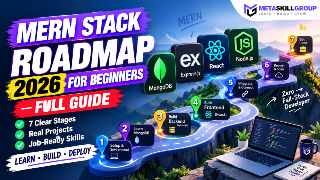 MERN Stack Roadmap for Beginners 2026: A Step-by-Step Guide to Becoming a Full-Stack DeveloperConfused about where to start with MERN? This step-by-step MERN stack roadmap for 2026 takes you from zero to your first full-stack project. Learn JavaScript, Node.js, Express, MongoDB and React in the right order, with a clear timeline, milestone projects, common mistakes and tips to learn faster with AI tools.
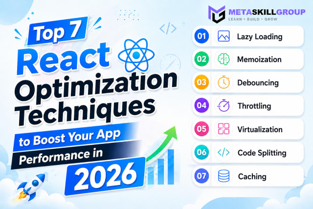 Top 7 React Optimization Techniques to Boost Your App Performance in 2026.Learn the top 7 React optimization techniques including Lazy Loading, Memoization, Debouncing, Throttling, Virtualization, Code Splitting, and Caching to build blazing fast React apps in 2026.
Need it built for you?
Built to the same standard as our client work.
If nothing here fits exactly, tell us what you need — our core developers build it. Requirements call first, a written SRS before any code, and a price agreed up front.