Crush Gallery — 3D Nested Photo Cube
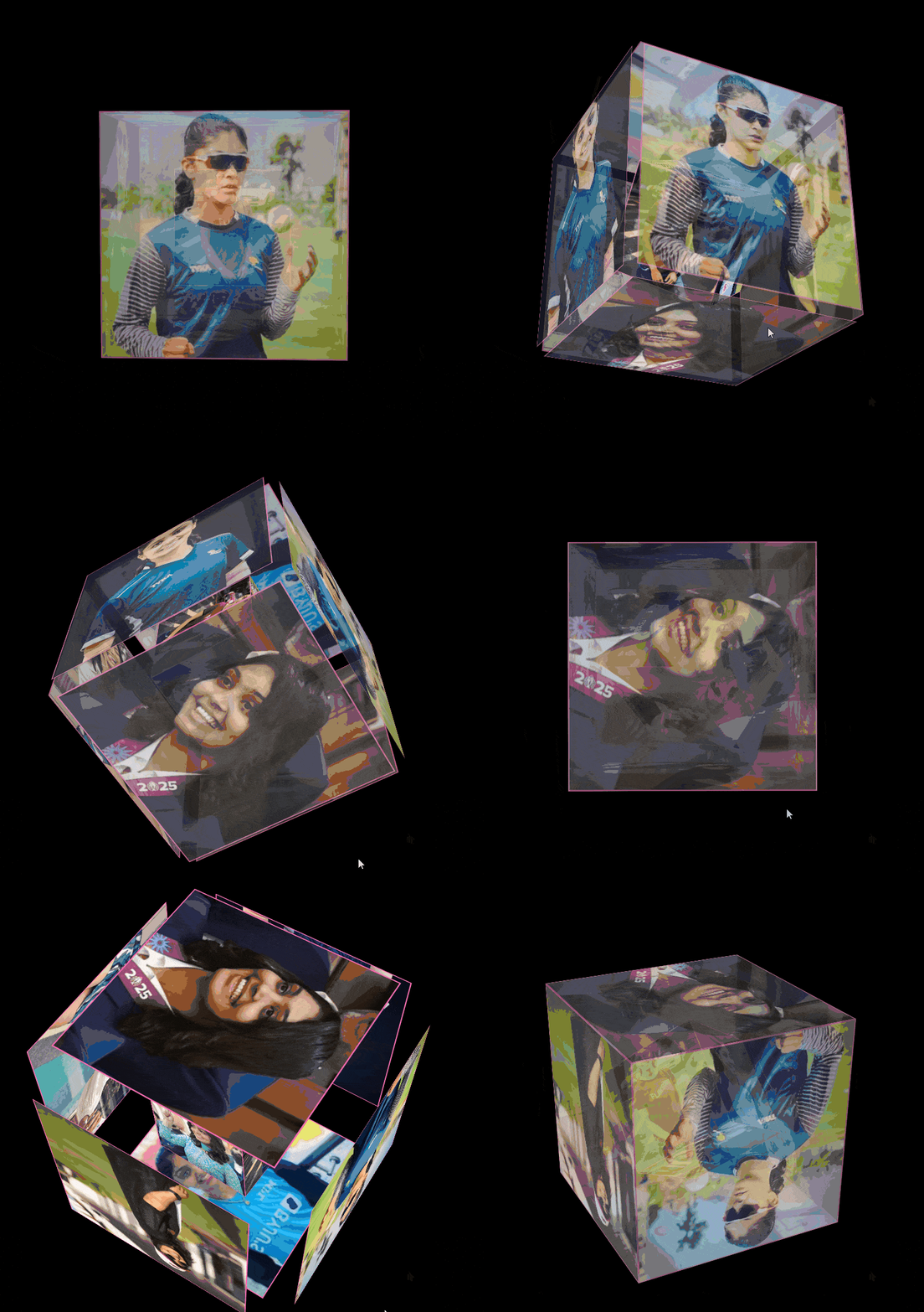
A romantic pure-CSS 3D nested cube gallery — two counter-rotating cubes (glassmorphism outer + pink-tinted inner) showcase your favorite photos, sharpening into focus on hover or tap. Touch-friendly, responsive, zero JavaScript.
- Published 26 Aug 2026
- 109 views
Overview
Crush Gallery — 3D Nested Photo Cube
A romantic pure-CSS 3D nested cube gallery — two counter-rotating cubes (an outer glassmorphism frame + a smaller inner pink-tinted cube) each showcase your favorite photos, sharpening into full focus on hover or tap. Pure CSS 3D transforms, fully responsive, zero JavaScript.
What's Included
- 3D perspective scene housing two counter-rotating cubes (outer 15s clockwise, inner 10s counter-clockwise)
- Outer cube — 6 glassmorphic faces (
backdrop-filter: blur, translucent pink border), dimmed until interacted with - Inner cube — nested at 50% scale, 6 pink-tinted photo faces rotating independently in reverse
- Hover/tap reveal — faces sharpen to full opacity, blur clears, border brightens, and the cube expands outward (
translateZ) - Touch-friendly —
:activestate mirrors:hoverso mobile taps trigger the same reveal - Editable quote overlay above the scene (script/serif quote + attribution line)
- Responsive breakpoint at 600px — scene shrinks from 300px to 250px with adjusted face offsets
- Pure HTML + CSS — zero JavaScript, zero external scripts
Dependencies
| Name | Version | Type |
|---|---|---|
| Google Fonts — Great Vibes + Montserrat | latest | CDN |
Copy the font
<link>tags into your<head>before the<style>block.
Desktop Preview
HTML
Self-contained single file — CSS lives inline inside the <head>'s <style> block, no separate stylesheet needed. Replace the placeholder image URLs with your own photos.
html1<!doctype html> 2<html> 3 <head> 4 <meta name="viewport" content="width=device-width, initial-scale=1.0" /> 5 <title>Crush Gallery – A 3D Tribute to Your Special One</title> 6 7 <!-- Google Fonts --> 8 <link rel="preconnect" href="https://fonts.googleapis.com" /> 9 <link rel="preconnect" href="https://fonts.gstatic.com" crossorigin /> 10 <link 11 href="https://fonts.googleapis.com/css2?family=Great+Vibes&family=Montserrat:wght@400;500;600&display=swap" 12 rel="stylesheet" 13 /> 14 15 <style> 16 * { 17 margin: 0; 18 padding: 0; 19 box-sizing: border-box; 20 } 21 22 body { 23 display: flex; 24 justify-content: center; 25 align-items: center; 26 min-height: 100vh; 27 margin: 0; 28 background: #000; 29 overflow-x: hidden; 30 } 31 .quote-container { 32 text-align: center; 33 position: absolute; 34 top: 0; 35 padding: 20px; 36 margin-bottom: 20px; 37 } 38 .quote { 39 font-family: "Great Vibes", cursive; 40 font-size: 2.5rem; 41 color: white; 42 text-shadow: 2px 2px 4px rgba(0, 0, 0, 0.3); 43 } 44 .quote-author { 45 font-family: "Montserrat", sans-serif; 46 font-size: 1rem; 47 color: rgba(255, 255, 255, 0.8); 48 margin-top: 10px; 49 } 50 .scene { 51 width: 300px; 52 height: 300px; 53 perspective: 1200px; 54 transform-style: preserve-3d; 55 margin: 20px; 56 margin-top: 30px; 57 transition: all 0.5s ease; 58 } 59 60 .outer-cube { 61 width: 100%; 62 height: 100%; 63 position: relative; 64 transform-style: preserve-3d; 65 animation: rotate 15s infinite linear; 66 pointer-events: none; 67 } 68 69 .face { 70 position: absolute; 71 width: 100%; 72 height: 100%; 73 background-size: cover; 74 transition: 75 transform 0.5s cubic-bezier(0.25, 0.1, 0.25, 1), 76 opacity 0.5s ease, 77 background-color 0.5s ease, 78 border 0.5s ease; 79 background-color: rgba(255, 255, 255, 0.2); 80 backdrop-filter: blur(10px); 81 border: 2px solid rgba(255, 105, 180, 0.5); 82 pointer-events: auto; 83 backface-visibility: visible; 84 box-shadow: 0 4px 6px rgba(0, 0, 0, 0.1); 85 opacity: 0.8; 86 } 87 88 .face img { 89 width: 100%; 90 height: 100%; 91 object-fit: cover; 92 pointer-events: none; 93 opacity: 0.7; 94 transition: opacity 0.5s ease; 95 } 96 97 .front { 98 transform: translateZ(150px); 99 } 100 .back { 101 transform: rotateY(180deg) translateZ(150px); 102 } 103 .right { 104 transform: rotateY(90deg) translateZ(150px); 105 } 106 .left { 107 transform: rotateY(-90deg) translateZ(150px); 108 } 109 .top { 110 transform: rotateX(90deg) translateZ(150px); 111 } 112 .bottom { 113 transform: rotateX(-90deg) translateZ(150px); 114 } 115 116 .scene:hover .face, 117 .scene:active .face { 118 background-color: rgba(255, 255, 255, 1); 119 backdrop-filter: blur(0); 120 opacity: 1; 121 border: 2px solid #ff69b4; 122 } 123 124 .scene:hover .face img, 125 .scene:active .face img { 126 opacity: 1; 127 } 128 129 .scene:hover .front, 130 .scene:active .front { 131 transform: translateZ(200px); 132 } 133 .scene:hover .back, 134 .scene:active .back { 135 transform: rotateY(180deg) translateZ(200px); 136 } 137 .scene:hover .right, 138 .scene:active .right { 139 transform: rotateY(90deg) translateZ(200px); 140 } 141 .scene:hover .left, 142 .scene:active .left { 143 transform: rotateY(-90deg) translateZ(200px); 144 } 145 .scene:hover .top, 146 .scene:active .top { 147 transform: rotateX(90deg) translateZ(200px); 148 } 149 .scene:hover .bottom, 150 .scene:active .bottom { 151 transform: rotateX(-90deg) translateZ(200px); 152 } 153 154 .inner-cube { 155 width: 50%; 156 height: 50%; 157 position: absolute; 158 top: 25%; 159 left: 25%; 160 transform-style: preserve-3d; 161 animation: rotate 10s infinite linear reverse; 162 pointer-events: none; 163 } 164 165 .inner-face { 166 position: absolute; 167 width: 100%; 168 height: 100%; 169 background-size: cover; 170 background-color: rgba(255, 192, 203, 0.9); 171 border: 1px solid #ff69b4; 172 backface-visibility: visible; 173 box-shadow: 0 0 5px rgba(0, 0, 0, 0.1); 174 } 175 176 .inner-face img { 177 width: 100%; 178 height: 100%; 179 object-fit: cover; 180 pointer-events: none; 181 } 182 183 .inner-front { 184 transform: translateZ(75px); 185 } 186 .inner-back { 187 transform: rotateY(180deg) translateZ(75px); 188 } 189 .inner-right { 190 transform: rotateY(90deg) translateZ(75px); 191 } 192 .inner-left { 193 transform: rotateY(-90deg) translateZ(75px); 194 } 195 .inner-top { 196 transform: rotateX(90deg) translateZ(75px); 197 } 198 .inner-bottom { 199 transform: rotateX(-90deg) translateZ(75px); 200 } 201 202 @keyframes rotate { 203 0% { 204 transform: rotateX(0) rotateY(0); 205 } 206 100% { 207 transform: rotateX(360deg) rotateY(360deg); 208 } 209 } 210 211 @media (max-width: 600px) { 212 .scene { 213 width: 250px; 214 height: 250px; 215 } 216 .front, 217 .back, 218 .right, 219 .left, 220 .top, 221 .bottom { 222 transform: translateZ(125px); 223 } 224 .scene:hover .front, 225 .scene:active .front { 226 transform: translateZ(175px); 227 } 228 } 229 </style> 230 </head> 231 <body> 232 <div class="quote-container"> 233 <p class="quote">"Every face of you is my favorite."</p> 234 <p class="quote-author">— A Little Reminder</p> 235 </div> 236 <div class="scene"> 237 <div class="outer-cube"> 238 <div class="face front"> 239 <img src="https://placehold.co/400x400/ff69b4/ffffff?text=Photo+1" alt="front" /> 240 </div> 241 <div class="face back"> 242 <img src="https://placehold.co/400x400/ff69b4/ffffff?text=Photo+2" alt="back" /> 243 </div> 244 <div class="face right"> 245 <img src="https://placehold.co/400x400/ff69b4/ffffff?text=Photo+3" alt="right" /> 246 </div> 247 <div class="face left"> 248 <img src="https://placehold.co/400x400/ff69b4/ffffff?text=Photo+4" alt="left" /> 249 </div> 250 <div class="face top"> 251 <img src="https://placehold.co/400x400/ff69b4/ffffff?text=Photo+5" alt="top" /> 252 </div> 253 <div class="face bottom"> 254 <img src="https://placehold.co/400x400/ff69b4/ffffff?text=Photo+6" alt="bottom" /> 255 </div> 256 257 <div class="inner-cube"> 258 <div class="inner-face inner-front"> 259 <img src="https://placehold.co/400x400/ffc0cb/ffffff?text=Inner+1" alt="inner front" /> 260 </div> 261 <div class="inner-face inner-back"> 262 <img src="https://placehold.co/400x400/ffc0cb/ffffff?text=Inner+2" alt="inner back" /> 263 </div> 264 <div class="inner-face inner-right"> 265 <img src="https://placehold.co/400x400/ffc0cb/ffffff?text=Inner+3" alt="inner right" /> 266 </div> 267 <div class="inner-face inner-left"> 268 <img src="https://placehold.co/400x400/ffc0cb/ffffff?text=Inner+4" alt="inner left" /> 269 </div> 270 <div class="inner-face inner-top"> 271 <img src="https://placehold.co/400x400/ffc0cb/ffffff?text=Inner+5" alt="inner top" /> 272 </div> 273 <div class="inner-face inner-bottom"> 274 <img src="https://placehold.co/400x400/ffc0cb/ffffff?text=Inner+6" alt="inner bottom" /> 275 </div> 276 </div> 277 </div> 278 </div> 279 </body> 280</html>
Built by MetaSkillGroup — copy it, use it, make it yours.
Features
Dual counter-rotating 3D cubes
Glassmorphism blur-to-sharp hover reveal
Touch-friendly (:active mirrors :hover)
Responsive scene resizing at 600px
Editable quote overlay; Zero JavaScript
Built With
HTML5
CSS3
Compatibility

Written by
MetaSkillGroup
Guides from our blog
 MERN Stack Roadmap for Beginners 2026: A Step-by-Step Guide to Becoming a Full-Stack DeveloperConfused about where to start with MERN? This step-by-step MERN stack roadmap for 2026 takes you from zero to your first full-stack project. Learn JavaScript, Node.js, Express, MongoDB and React in the right order, with a clear timeline, milestone projects, common mistakes and tips to learn faster with AI tools.
 Free Online Internship for Students in 2026: How to Find a Real One (With Certificate)A simple 2026 guide to free online internships for students and freshers in India: what a good internship gives you, where to find one, how to get selected without experience, and how a work-from-home internship with a verifiable certificate works.
 How to Build a Website with AI Agents in 2026: A Step-by-Step GuideLearn how to build a website with AI agents in 2026, step by step. Compare tools like Lovable, v0, Bolt, Replit and Cursor, write prompts that actually work, test AI-generated code, optimize for SEO and publish your site live, even if you only know a little code.
Need it built for you?
Built to the same standard as our client work.
If nothing here fits exactly, tell us what you need — our core developers build it. Requirements call first, a written SRS before any code, and a price agreed up front.