UI Component
✨ NewUI Element
Holographic 3D Tilt Cards with Flip Animation
Collectible-style cards that tilt in 3D as you move your cursor or finger, with a rainbow holographic foil and a glare that follows the pointer. Click or press Enter to flip a card and reveal its back. Built with pure HTML, CSS and vanilla JavaScript.
September 26, 20263 views
- Cards
- cards
- 3d-tilt
- holographic
- hover-effect
- flip-card
- css-animation
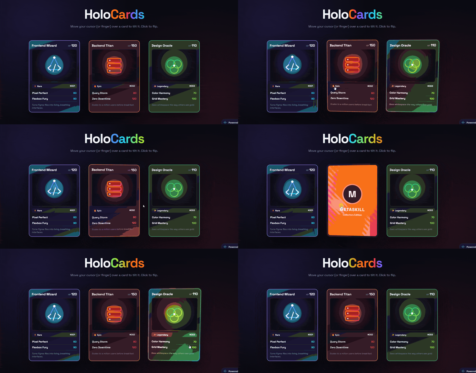
Features Included
Smooth 3D tilt driven by pointer position (mouse and touch)
Rainbow holographic foil using blend modes, stronger at the edges
Glare highlight that follows the pointer
Click / tap / Enter to flip and show the card back
Three ready-made cards with SVG artwork and stats
Keyboard accessible and responsive
Holographic 3D Tilt Cards with Flip Animation
Trading-card style UI with a real holographic feel — 3D tilt, rainbow foil, moving glare and a flip animation. Pure HTML, CSS and vanilla JavaScript.
What's Included
- Smooth 3D tilt driven by pointer position (mouse and touch)
- Rainbow holographic foil using blend modes, stronger at the edges
- Glare highlight that follows the pointer
- Click / tap / Enter to flip and show the card back
- Three ready-made cards with SVG artwork and stats
- Keyboard accessible and responsive
Dependencies
- Google Fonts — Space Grotesk https://fonts.googleapis.com/css2?family=Space+Grotesk:wght@400;500;600;700&display=swap
Already linked inside the component's files — no extra setup needed.
Desktop Preview
HTML
html1<!doctype html> 2<html lang="en"> 3 <head> 4 <meta charset="UTF-8" /> 5 <meta name="viewport" content="width=device-width, initial-scale=1.0" /> 6 <title>Holographic 3D Tilt Cards | MetaSkillGroup</title> 7 <link rel="stylesheet" href="style.css" /> 8 </head> 9 <body> 10 <!-- created by metaskillgroup-team --> 11 <main class="showcase"> 12 <header class="intro"> 13 <h1>Holo<span>Cards</span></h1> 14 <p>Move your cursor (or finger) over a card to tilt it. Click to flip.</p> 15 </header> 16 17 <div class="deck"> 18 <!-- Card 1 --> 19 <div class="card" style="--c1: #7c5cff; --c2: #22d3ee" tabindex="0" aria-label="Frontend Wizard card, press Enter to flip"> 20 <div class="card-inner"> 21 <div class="face front"> 22 <div class="card-head"> 23 <span class="card-name">Frontend Wizard</span> 24 <span class="card-hp">HP <b>120</b></span> 25 </div> 26 <div class="card-art"> 27 <svg viewBox="0 0 200 140" aria-hidden="true"> 28 <defs> 29 <linearGradient id="g1" x1="0" x2="1" y1="0" y2="1"> 30 <stop offset="0" stop-color="#7c5cff" /> 31 <stop offset="1" stop-color="#22d3ee" /> 32 </linearGradient> 33 </defs> 34 <circle cx="100" cy="70" r="46" fill="url(#g1)" opacity=".25" /> 35 <path d="M70 90 L100 30 L130 90 Z" fill="none" stroke="url(#g1)" stroke-width="4" stroke-linejoin="round" /> 36 <path d="M82 70 l-14 12 14 12 M118 70 l14 12 -14 12 M106 64 l-12 36" fill="none" stroke="#fff" stroke-width="4" stroke-linecap="round" stroke-linejoin="round" /> 37 <circle cx="100" cy="30" r="6" fill="#fff" /> 38 </svg> 39 </div> 40 <div class="card-type"><span>⚡ Rare</span><span>#001</span></div> 41 <ul class="card-moves"> 42 <li><b>Pixel Perfect</b><em>60</em></li> 43 <li><b>Flexbox Fury</b><em>90</em></li> 44 </ul> 45 <p class="card-flavor">Turns Figma files into living, breathing interfaces.</p> 46 </div> 47 <div class="face back"> 48 <div class="back-logo">M</div> 49 <p>MetaSkill</p> 50 <small>Collectors Edition</small> 51 </div> 52 </div> 53 <div class="holo" aria-hidden="true"></div> 54 <div class="glare" aria-hidden="true"></div> 55 </div> 56 57 <!-- Card 2 --> 58 <div class="card" style="--c1: #f97316; --c2: #f43f5e" tabindex="0" aria-label="Backend Titan card, press Enter to flip"> 59 <div class="card-inner"> 60 <div class="face front"> 61 <div class="card-head"> 62 <span class="card-name">Backend Titan</span> 63 <span class="card-hp">HP <b>150</b></span> 64 </div> 65 <div class="card-art"> 66 <svg viewBox="0 0 200 140" aria-hidden="true"> 67 <defs> 68 <linearGradient id="g2" x1="0" x2="1" y1="0" y2="1"> 69 <stop offset="0" stop-color="#f97316" /> 70 <stop offset="1" stop-color="#f43f5e" /> 71 </linearGradient> 72 </defs> 73 <circle cx="100" cy="70" r="46" fill="url(#g2)" opacity=".25" /> 74 <rect x="66" y="34" width="68" height="20" rx="6" fill="none" stroke="url(#g2)" stroke-width="4" /> 75 <rect x="66" y="60" width="68" height="20" rx="6" fill="none" stroke="url(#g2)" stroke-width="4" /> 76 <rect x="66" y="86" width="68" height="20" rx="6" fill="none" stroke="url(#g2)" stroke-width="4" /> 77 <circle cx="78" cy="44" r="3" fill="#fff" /><circle cx="78" cy="70" r="3" fill="#fff" /><circle cx="78" cy="96" r="3" fill="#fff" /> 78 </svg> 79 </div> 80 <div class="card-type"><span>🔥 Epic</span><span>#002</span></div> 81 <ul class="card-moves"> 82 <li><b>Query Storm</b><em>80</em></li> 83 <li><b>Zero Downtime</b><em>120</em></li> 84 </ul> 85 <p class="card-flavor">Scales to a million users before breakfast.</p> 86 </div> 87 <div class="face back"> 88 <div class="back-logo">M</div> 89 <p>MetaSkill</p> 90 <small>Collectors Edition</small> 91 </div> 92 </div> 93 <div class="holo" aria-hidden="true"></div> 94 <div class="glare" aria-hidden="true"></div> 95 </div> 96 97 <!-- Card 3 --> 98 <div class="card" style="--c1: #10b981; --c2: #a3e635" tabindex="0" aria-label="Design Oracle card, press Enter to flip"> 99 <div class="card-inner"> 100 <div class="face front"> 101 <div class="card-head"> 102 <span class="card-name">Design Oracle</span> 103 <span class="card-hp">HP <b>110</b></span> 104 </div> 105 <div class="card-art"> 106 <svg viewBox="0 0 200 140" aria-hidden="true"> 107 <defs> 108 <linearGradient id="g3" x1="0" x2="1" y1="0" y2="1"> 109 <stop offset="0" stop-color="#10b981" /> 110 <stop offset="1" stop-color="#a3e635" /> 111 </linearGradient> 112 </defs> 113 <circle cx="100" cy="70" r="46" fill="url(#g3)" opacity=".25" /> 114 <circle cx="84" cy="62" r="20" fill="none" stroke="url(#g3)" stroke-width="4" /> 115 <circle cx="116" cy="62" r="20" fill="none" stroke="url(#g3)" stroke-width="4" /> 116 <circle cx="100" cy="88" r="20" fill="none" stroke="url(#g3)" stroke-width="4" /> 117 <circle cx="100" cy="70" r="5" fill="#fff" /> 118 </svg> 119 </div> 120 <div class="card-type"><span>✨ Legendary</span><span>#003</span></div> 121 <ul class="card-moves"> 122 <li><b>Color Harmony</b><em>70</em></li> 123 <li><b>Grid Mastery</b><em>100</em></li> 124 </ul> 125 <p class="card-flavor">Sees whitespace the way others see gold.</p> 126 </div> 127 <div class="face back"> 128 <div class="back-logo">M</div> 129 <p>MetaSkill</p> 130 <small>Collectors Edition</small> 131 </div> 132 </div> 133 <div class="holo" aria-hidden="true"></div> 134 <div class="glare" aria-hidden="true"></div> 135 </div> 136 </div> 137 </main> 138 139 <script src="script.js"></script> 140 </body> 141</html> 142
CSS
css1/* Importing Google Fonts - Space Grotesk */ 2@import url("https://fonts.googleapis.com/css2?family=Space+Grotesk:wght@400;500;600;700&display=swap"); 3 4* { 5 margin: 0; 6 padding: 0; 7 box-sizing: border-box; 8 font-family: "Space Grotesk", sans-serif; 9} 10 11:root { 12 --bg: #0a0a12; 13 --text: #f5f5fa; 14 --muted: #8f8fa8; 15} 16 17body { 18 min-height: 100vh; 19 color: var(--text); 20 background: 21 radial-gradient(circle at 20% 20%, rgba(124, 92, 255, 0.15), transparent 40%), 22 radial-gradient(circle at 80% 80%, rgba(244, 63, 94, 0.12), transparent 40%), 23 var(--bg); 24} 25 26.showcase { 27 max-width: 1200px; 28 margin: 0 auto; 29 padding: 70px 20px 90px; 30} 31 32.intro { 33 text-align: center; 34 margin-bottom: 60px; 35} 36 37.intro h1 { 38 font-size: clamp(2.6rem, 7vw, 4.4rem); 39 font-weight: 700; 40 letter-spacing: -0.04em; 41} 42 43.intro h1 span { 44 background: linear-gradient(90deg, #7c5cff, #22d3ee, #a3e635, #f97316, #f43f5e); 45 background-size: 200% auto; 46 -webkit-background-clip: text; 47 background-clip: text; 48 color: transparent; 49 animation: rainbow 6s linear infinite; 50} 51 52@keyframes rainbow { 53 to { 54 background-position: 200% center; 55 } 56} 57 58.intro p { 59 margin-top: 10px; 60 color: var(--muted); 61} 62 63/* ---------- Deck ---------- */ 64.deck { 65 display: flex; 66 flex-wrap: wrap; 67 justify-content: center; 68 gap: 40px; 69 perspective: 1200px; 70} 71 72/* ---------- Card ---------- */ 73.card { 74 --rx: 0deg; 75 --ry: 0deg; 76 --px: 50%; 77 --py: 50%; 78 --hyp: 0; 79 position: relative; 80 width: 280px; 81 aspect-ratio: 5 / 7; 82 border-radius: 20px; 83 cursor: pointer; 84 outline: none; 85 transform-style: preserve-3d; 86 transform: rotateX(var(--rx)) rotateY(var(--ry)); 87 transition: transform 0.6s cubic-bezier(0.22, 1, 0.36, 1); 88 will-change: transform; 89} 90 91.card.active { 92 transition: transform 0.08s linear; 93} 94 95.card:focus-visible { 96 box-shadow: 0 0 0 3px var(--c2); 97} 98 99.card-inner { 100 position: absolute; 101 inset: 0; 102 transform-style: preserve-3d; 103 transition: transform 0.8s cubic-bezier(0.22, 1, 0.36, 1); 104} 105 106.card.flipped .card-inner { 107 transform: rotateY(180deg); 108} 109 110.face { 111 position: absolute; 112 inset: 0; 113 border-radius: 20px; 114 backface-visibility: hidden; 115 -webkit-backface-visibility: hidden; 116 overflow: hidden; 117 box-shadow: 0 25px 60px rgba(0, 0, 0, 0.55); 118} 119 120/* ---------- Front face ---------- */ 121.front { 122 display: flex; 123 flex-direction: column; 124 gap: 10px; 125 padding: 14px; 126 background: 127 linear-gradient(160deg, color-mix(in srgb, var(--c1) 35%, #15151f), #15151f 55%, color-mix(in srgb, var(--c2) 30%, #15151f)); 128 border: 6px solid transparent; 129 background-clip: padding-box; 130 outline: 2px solid color-mix(in srgb, var(--c1) 70%, #fff); 131 outline-offset: -6px; 132} 133 134.card-head { 135 display: flex; 136 justify-content: space-between; 137 align-items: baseline; 138} 139 140.card-name { 141 font-weight: 700; 142 font-size: 1.05rem; 143} 144 145.card-hp { 146 font-size: 0.72rem; 147 color: var(--muted); 148} 149 150.card-hp b { 151 font-size: 1.1rem; 152 color: var(--text); 153} 154 155.card-art { 156 flex: 1; 157 display: grid; 158 place-items: center; 159 border-radius: 10px; 160 background: 161 radial-gradient(circle at 50% 40%, color-mix(in srgb, var(--c2) 40%, transparent), transparent 70%), 162 #0c0c14; 163 border: 2px solid rgba(255, 255, 255, 0.12); 164 overflow: hidden; 165} 166 167.card-art svg { 168 width: 90%; 169 filter: drop-shadow(0 0 12px color-mix(in srgb, var(--c1) 60%, transparent)); 170 animation: bob 4s ease-in-out infinite; 171} 172 173@keyframes bob { 174 50% { 175 transform: translateY(-6px); 176 } 177} 178 179.card-type { 180 display: flex; 181 justify-content: space-between; 182 padding: 4px 10px; 183 border-radius: 6px; 184 font-size: 0.72rem; 185 font-weight: 600; 186 background: rgba(255, 255, 255, 0.08); 187} 188 189.card-moves { 190 list-style: none; 191} 192 193.card-moves li { 194 display: flex; 195 justify-content: space-between; 196 padding: 6px 2px; 197 font-size: 0.85rem; 198 border-bottom: 1px solid rgba(255, 255, 255, 0.08); 199} 200 201.card-moves em { 202 font-style: normal; 203 font-weight: 700; 204 color: var(--c2); 205} 206 207.card-flavor { 208 font-size: 0.7rem; 209 font-style: italic; 210 color: var(--muted); 211 line-height: 1.4; 212 min-height: 2.8em; 213} 214 215/* ---------- Back face ---------- */ 216.back { 217 display: flex; 218 flex-direction: column; 219 align-items: center; 220 justify-content: center; 221 gap: 6px; 222 transform: rotateY(180deg); 223 background: 224 repeating-linear-gradient(45deg, rgba(255, 255, 255, 0.04) 0 10px, transparent 10px 20px), 225 linear-gradient(145deg, var(--c1), var(--c2)); 226 border: 8px solid #15151f; 227} 228 229.back-logo { 230 display: grid; 231 place-items: center; 232 width: 96px; 233 height: 96px; 234 border-radius: 50%; 235 font-size: 3rem; 236 font-weight: 700; 237 background: #15151f; 238 box-shadow: 239 0 0 0 6px rgba(255, 255, 255, 0.25), 240 0 0 40px rgba(0, 0, 0, 0.4); 241} 242 243.back p { 244 margin-top: 14px; 245 font-size: 1.4rem; 246 font-weight: 700; 247 letter-spacing: 0.1em; 248 text-transform: uppercase; 249} 250 251.back small { 252 font-size: 0.75rem; 253 opacity: 0.85; 254} 255 256/* ---------- Holo + glare overlays ---------- */ 257.holo, 258.glare { 259 position: absolute; 260 inset: 0; 261 border-radius: 20px; 262 pointer-events: none; 263 transform: translateZ(2px); 264 opacity: 0; 265 transition: opacity 0.4s ease; 266} 267 268/* Rainbow foil that shifts with the pointer */ 269.holo { 270 background: 271 repeating-linear-gradient( 272 115deg, 273 #ff0080 0%, 274 #ffb300 8%, 275 #3dff8a 16%, 276 #00c3ff 24%, 277 #a64dff 32%, 278 #ff0080 40% 279 ), 280 repeating-linear-gradient(35deg, rgba(255, 255, 255, 0.4) 0 2px, transparent 2px 6px); 281 background-size: 282 300% 300%, 283 100% 100%; 284 background-position: 285 var(--px) var(--py), 286 center; 287 mix-blend-mode: color-dodge; 288 filter: brightness(0.6) contrast(1.4) saturate(1.2); 289} 290 291/* Soft light spot under the pointer */ 292.glare { 293 background: radial-gradient( 294 circle at var(--px) var(--py), 295 rgba(255, 255, 255, 0.55) 0%, 296 rgba(255, 255, 255, 0.15) 25%, 297 transparent 55% 298 ); 299 mix-blend-mode: overlay; 300} 301 302.card.active .holo { 303 opacity: calc(0.35 + var(--hyp) * 0.5); 304} 305 306.card.active .glare { 307 opacity: 1; 308} 309 310/* ---------- Responsive ---------- */ 311@media (max-width: 640px) { 312 .deck { 313 gap: 28px; 314 } 315 316 .card { 317 width: min(280px, 82vw); 318 } 319} 320 321@media (prefers-reduced-motion: reduce) { 322 *, 323 *::before, 324 *::after { 325 animation: none !important; 326 } 327} 328
JavaScript
javascript1const cards = document.querySelectorAll(".card"); 2const MAX_TILT = 16; // degrees 3 4cards.forEach((card) => { 5 let resetTimer; 6 7 const update = (e) => { 8 const rect = card.getBoundingClientRect(); 9 // Pointer position inside the card, 0..1 10 const x = Math.min(Math.max((e.clientX - rect.left) / rect.width, 0), 1); 11 const y = Math.min(Math.max((e.clientY - rect.top) / rect.height, 0), 1); 12 const dx = x - 0.5; 13 const dy = y - 0.5; 14 15 // Flipped cards mirror horizontally, so invert the Y rotation 16 const flip = card.classList.contains("flipped") ? -1 : 1; 17 18 card.style.setProperty("--rx", `${-dy * MAX_TILT * 2}deg`); 19 card.style.setProperty("--ry", `${dx * MAX_TILT * 2 * flip}deg`); 20 card.style.setProperty("--px", `${x * 100}%`); 21 card.style.setProperty("--py", `${y * 100}%`); 22 // Distance from the centre drives how strong the foil looks 23 card.style.setProperty("--hyp", Math.min(Math.hypot(dx, dy) * 2, 1).toFixed(2)); 24 }; 25 26 card.addEventListener("pointerenter", () => { 27 clearTimeout(resetTimer); 28 card.classList.add("active"); 29 }); 30 31 card.addEventListener("pointermove", update); 32 33 card.addEventListener("pointerleave", () => { 34 card.classList.remove("active"); 35 card.style.setProperty("--rx", "0deg"); 36 card.style.setProperty("--ry", "0deg"); 37 resetTimer = setTimeout(() => { 38 card.style.setProperty("--px", "50%"); 39 card.style.setProperty("--py", "50%"); 40 }, 400); 41 }); 42 43 // Flip on click / tap / keyboard 44 const flip = () => card.classList.toggle("flipped"); 45 card.addEventListener("click", flip); 46 card.addEventListener("keydown", (e) => { 47 if (e.key === "Enter" || e.key === " ") { 48 e.preventDefault(); 49 flip(); 50 } 51 }); 52}); 53
Built by Meta Skill Group — copy it, use it, make it yours.
Built With
🌐
HTML5
⚡
JavaScript
🎨
CSS3
Compatibility
Browsers
ChromeOperaBraveFirefoxSafariArcVivaldiEdge
Devices
DesktopMobileSmartwatchTVTablet
Frameworks
HTML/CSSVanilla JS
Found this useful?

Written by
MetaSkillGroup
September 26, 2026